Roku Recommends
Asset Creation | Illustration | Animation
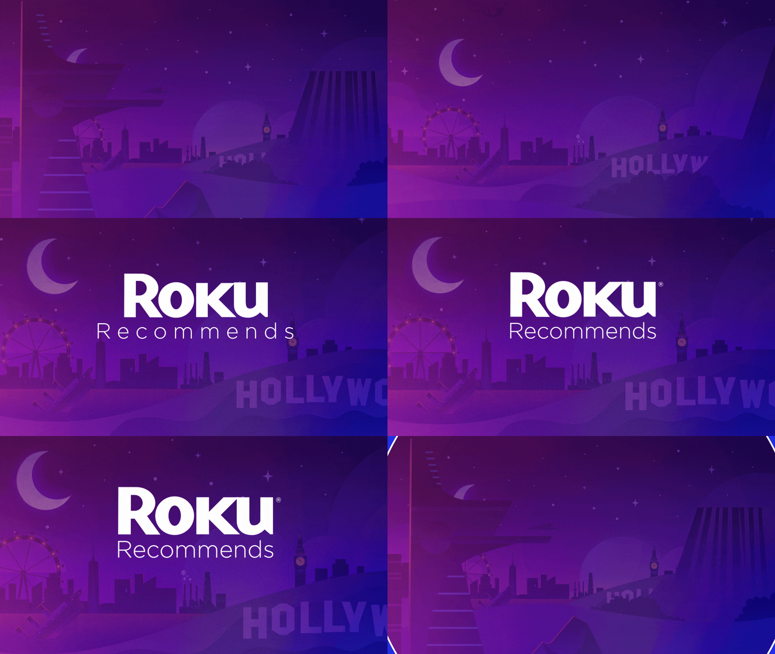
Rolling into its second season after a successful season one, the folks at Roku were looking for a complete graphics package audit and a substantial asset build-out. The goal was to add some additional production value to the program by modernizing their current graphics package while simultaneously focusing on establishing a consistent design language for the show. The starting point for this new, unified language was our creation of the show’s opening title animation.
Opening Title Exploration
To support the text treatment and animation that was chosen, the next step was to dive into and pull individual assets from Roku’s robust library of brand design elements. We tried to keep things accessible, while still bespoke, by choosing a collection of assets that reference famous locations, classic films, or entire entertainment genres vs specific modern film & tv references.
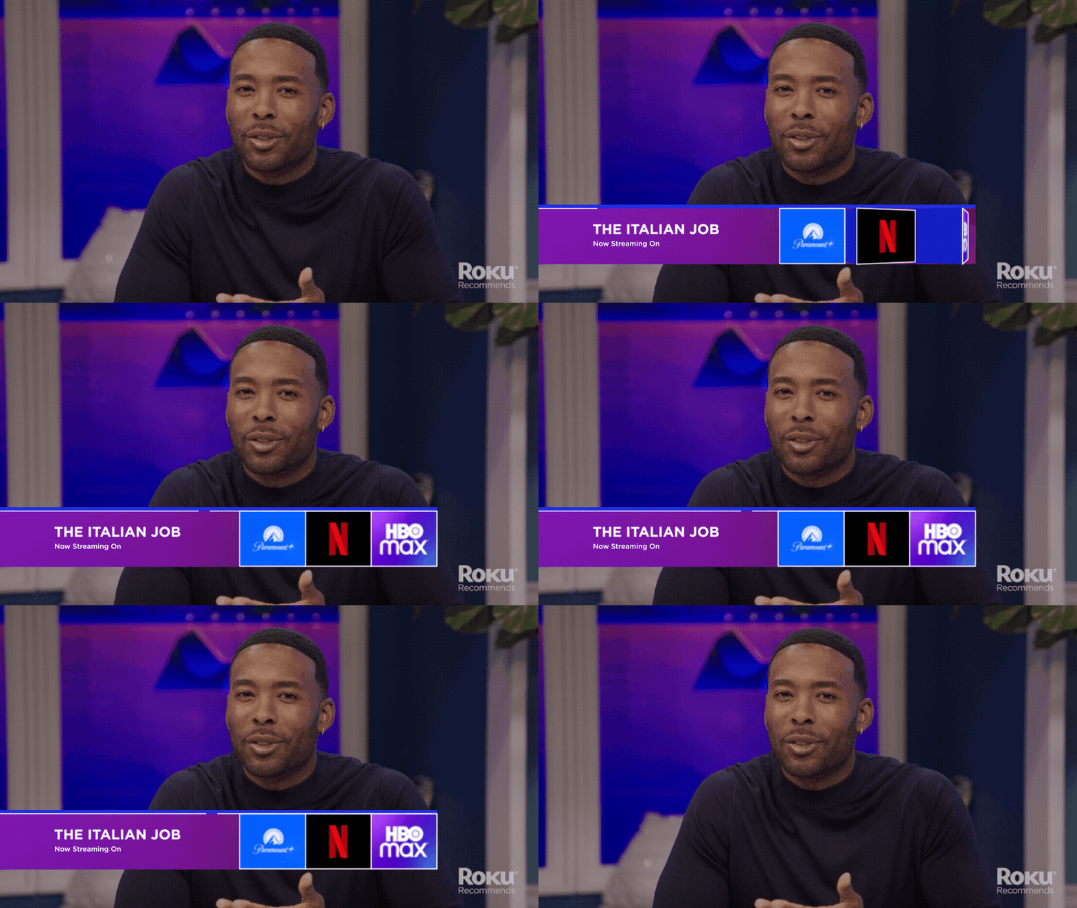
Lower Thirds
Roku Recommends is chock full of movie titles, special guests, and Hollywood locations. A line-up like this makes for a great show, but it makes designing a lower third that’s modular enough to handle the range of content necessary (while still maintaining consistency) an exciting challenge.
